- R 語言的視覺化
- 大數據的資料視覺化
- 關於swirl
R 的資料視覺化
Wush Wu
國立台灣大學
課程內容
R 語言的視覺化
R 的繪圖引擎
- X11: Unix 作業系統上的X11 桌面系統
- windows: 用於Windows系統
- quartz: Mac OS X 系統
- postscript: 用於印表機或是建立PostScript文件
- pdf, png, jpeg: 用於建立特定格式的檔案
- html 和 javascript: 用於建立網頁上的互動式圖表
R 的繪圖簡介
- API 設計
- 基本繪圖API
- ggplot2
R 的各種基礎Visualization API
Visualization 簡單分類
- 單變數
- 類別型變數
- 連續型變數
- 雙變數
- 連續 vs 連續
- 連續 vs 離散
- 連續 vs 連續
- 多變量
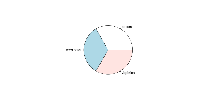
類別型變數
pie(table(iris$Species))
連續型變數
par(mfrow = c(1, 2))
plot(density(iris$Sepal.Length))
hist(iris$Sepal.Length)

類別 v.s. 類別
data(Titanic)
mosaicplot(~ Sex + Survived, data = Titanic,
           main = "Survival on the Titanic", color = TRUE)

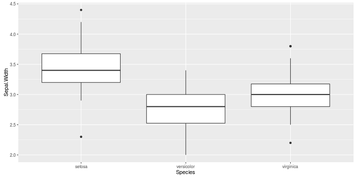
類別 v.s. 連續
plot(Sepal.Length ~ Species, iris)

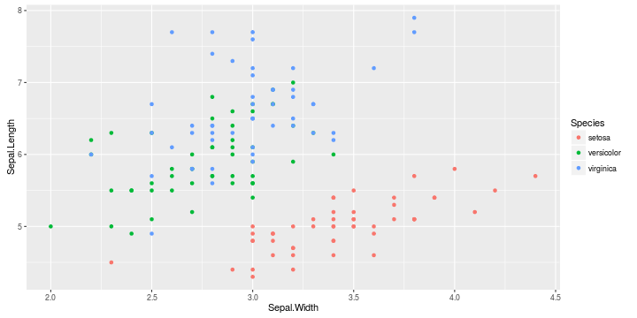
連續 v.s. 連續
plot(dist ~ speed, cars)

多變量
plot(iris)

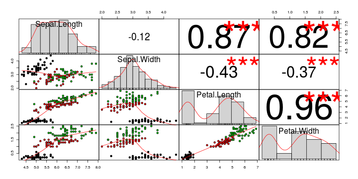
多變量
suppressPackageStartupMessages(library(PerformanceAnalytics))
suppressWarnings(chart.Correlation(iris[-5], bg=iris$Species, pch=21))
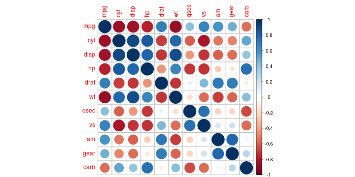
多變量
library(corrplot)
corrplot(cor(mtcars), method = "circle")
各種R 和分析結果結合的視覺化
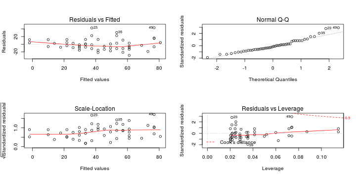
plot和Linear Regression
g <- lm(dist ~ speed, cars)
par(mfrow = c(2,2))
plot(g)
plot和Regression
plot(cars, main = "lowess(cars)")
lines(lowess(cars), col = 2)
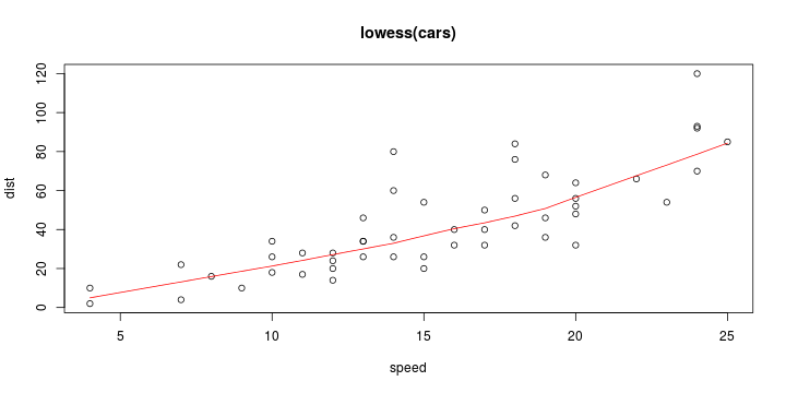
W. S. Cleveland, E. Grosse and W. M. Shyu (1992) Local regression models. Chapter 8 of Statistical Models in S eds J.M. Chambers and T.J. Hastie, Wadsworth & Brooks/Cole.
plot和Regression
suppressPackageStartupMessages(library(sm))
with(cars, sm.regression(dist, speed, method = "aicc",
                         col = "red", model = "linear"))
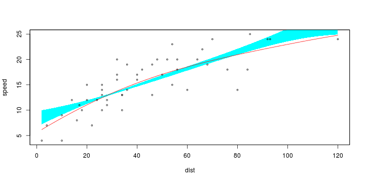
Bowman, A.W. and Azzalini, A. (1997). Applied Smoothing Techniques for Data Analysis: the Kernel Approach with S-Plus Illustrations. Oxford University Press, Oxford.
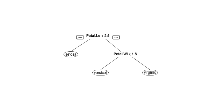
plot和Decision Tree
library(rpart)
library(rpart.plot)
rpart.plot(rpart(Species ~ ., iris))
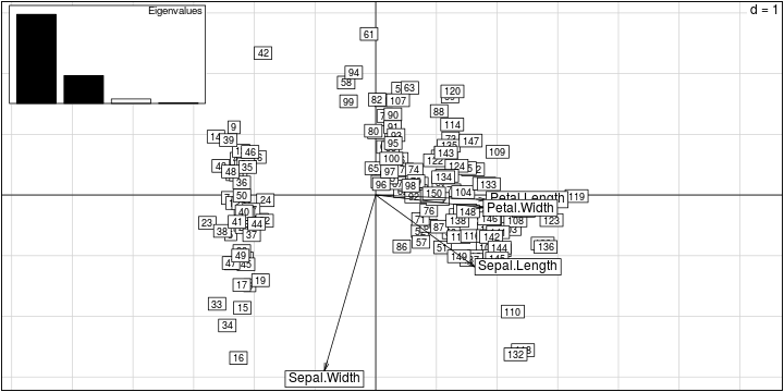
多變量 PCA
library(ade4)
g <- dudi.pca(iris[,-5], scan = FALSE)
scatter(g)
R 的基本繪圖API
- 高階繪圖指令:依據輸入的資料產生完整的圖片
- 低階繪圖指令:修飾當前的圖片
基礎繪圖方式與R 的基本繪圖API
- 泛用型的物件導向API:
plot本身能以直角座標系統繪製各種幾何圖形plot能和模型結合,依據模型的型態繪製各種模型的結果plot.lm,rpart::plot.rpart
基礎繪圖API
pie,hist,boxplot,barplot, ...- 清空之前的繪圖結果
lines,points,legend,title,text,polygon, ..- 修飾之前的繪圖結果
par- 控制繪圖引擎的參數
ggplot2
Reference
- Wilkinson, Leland (2005). The Grammar of Graphics. Springer. ISBN 978-0-387-98774-3.
ggplot2 的邏輯
- 基礎API 是一種用紙筆模型來繪圖的設計思想
- ggplot2 是一種以繪圖物件為主的設計思想
ggplot2 對R 的影響
- 大量以ggplot2的API 為骨幹的套件
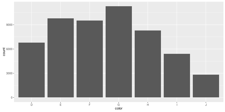
ggplot2 離散
data(diamonds, package = "ggplot2")
ggplot(diamonds, aes(x = color)) +
  geom_bar()
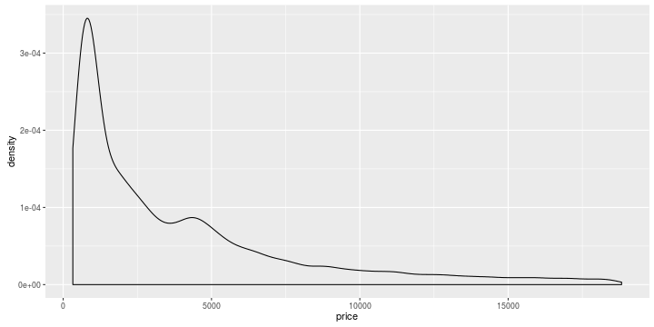
ggplot2 連續
ggplot(diamonds, aes(x = price)) +
  geom_density()
ggplot2 離散 v.s. 離散
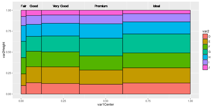
http://stackoverflow.com/questions/19233365/how-to-create-a-marimekko-mosaic-plot-in-ggplot2
ggplot2 類別 v.s. 連續
ggplot(iris, aes(x = Species, y = Sepal.Width)) +
  geom_boxplot()
ggplot2 連續 v.s. 連續
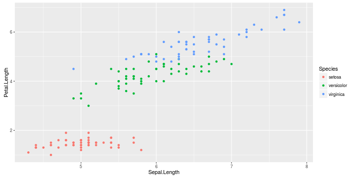
ggplot(iris, aes(x = Sepal.Width, y = Sepal.Length, color = Species)) +
  geom_point()
大數據時代的視覺化
大數據時代視覺化的挑戰
- 資料太大,直接化就當機,打開圖的人也會當機
- 資料的維度太多,需要能對圖做操作,而不是程式碼
- 資料的種類更廣泛,除了離散、數值之外,還包含如「圖資」等各種資料
tabplot
- Google: "R big data visualization"
- https://cran.r-project.org/web/packages/tabplot/vignettes/tabplot-vignette.html
- 初步解決了數據量的問題
Web Based 的互動式解決方案
- Java Script
- http://www.htmlwidgets.org/
- 透過互動圖表解決資料維度更多的問題
- http://yihui.name/recharts/
- Shiny
Open Source 太棒了
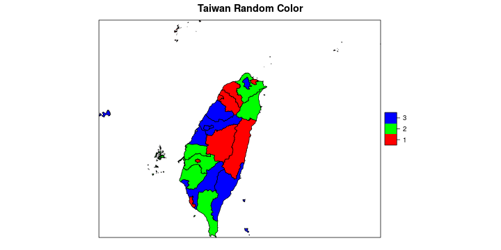
地圖
suppressPackageStartupMessages(library(Rtwmap))
data(county1984)
random.color <- as.factor(sample(1:3, length(county1984), TRUE))
color <- rainbow(3)
county1984$random.color <- random.color
spplot(county1984, "random.color", col.regions = color, main = "Taiwan Random Color")
Network Visualization
suppressPackageStartupMessages(library(networkD3))
data(MisLinks)
data(MisNodes)
# Create graph
forceNetwork(Links = MisLinks, Nodes = MisNodes, Source = "source",
             Target = "target", Value = "value", NodeID = "name",
             Group = "group", opacity = 0.4, zoom = TRUE)
資料的流動 - Sankey Diagram
http://www.magesblog.com/2014/03/sankey-diagrams-with-googlevis.html
R 與數據模型
數據模型的API 設計模式
- 線性代數介面
- Formula 介面
線性代數介面
g <- lm.fit(X, y, ...)
- \(X\): 一個代表解釋變數的矩陣
- \(y\): 一個代表應變數的向量
- \(...\): 控制演算法的參數
Formula 介面
g <- lm(y ~ x1 + x2 + x3, data, ...)
predict(g, data2)
- \(y \sim x_1 + x_2 + x_3\): 描述y 和X 的關係
- \(data\): 描述$y, x_1, x_2, x_3$的來源
- \(...\): 控制演算法的參數
- Formula 介面支援各種Operator:
+-:*|^I1
兩種介面的比較
- 線性代數介面:
- 可以控制資料結構
- 可以做更高的客製化
- 必須要自己從資料建立矩陣ex:
model.matrix
- Formula 介面:
- 更清楚的程式碼
- 更彈性、簡潔的語法ex:
log(dist) ~ I(speed^2) - 被公認的好設計
關於swirl
今日課程規劃
- RDataEngineer-05-Data-Manipulation
- RDataEngineer-06-Join
- RVisualization-01-One-Variable-Visualization
- RVisualization-02-Two-Variables-Visualization
- RVisualization-03-ggplot2
- RVisualization-04-Javascript-And-Maps
中文顯示問題
Mac:
- Basic plots:
par(family="STKaiti") - ggplot2:
+ theme_grey(base_family="STKaiti")需要透過theme改字型
課程筆記
- 會透過電子信箱寄給同學
- 未來在課程網頁上也會更新
課程內容更新
- 今天早上Github遭受攻擊...
library(swirl)
delete_progress("<你在swirl所輸入的id>")
uninstall_all_courses()
dst <- tempfile(fileext = ".zip")
download.file("http://www.wush978.idv.tw/DataScienceAndR.zip", dst)
install_course_zip(dst)
swirl()